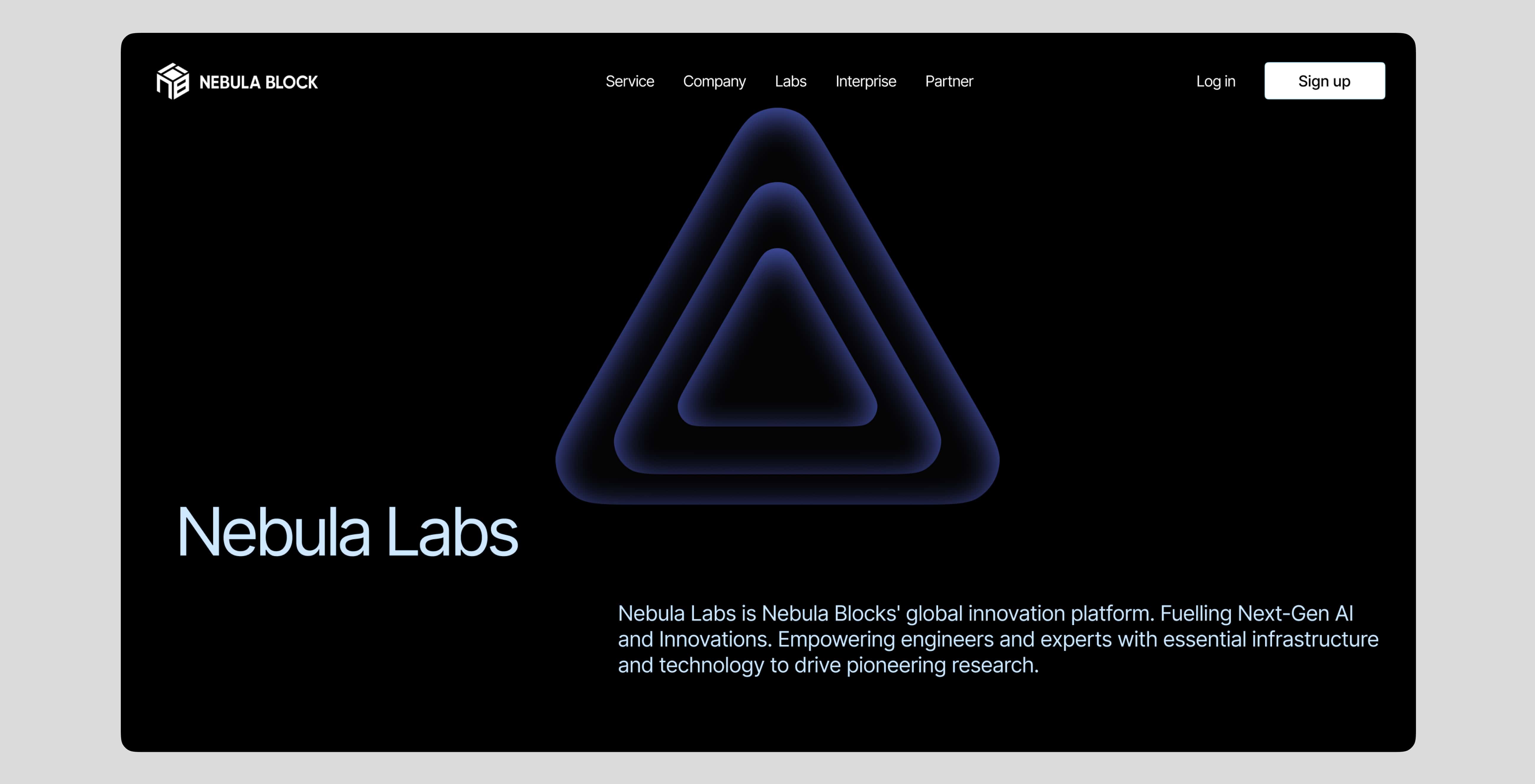
Nebula Block is an innovative cloud infrastructure platform tailored for AI. Originally focused on delivering cloud services to the Web3 industry, Nebula is now undergoing a rebranding to pivot towards AI cloud services. This transition calls for a simple, intuitive UI/UX that enhances user experience. My role is to design a seamless, straightforward experience throughout the entire deployment process, ensuring ease of use and accessibility for all users.

1
Brand Research
Competitive Analysis
User’s Pain Point
2
Developing a Solution
Unique Selling Proposition
3
Define the Brand Tone
4
Final Prototype
5
Refine and Perfect
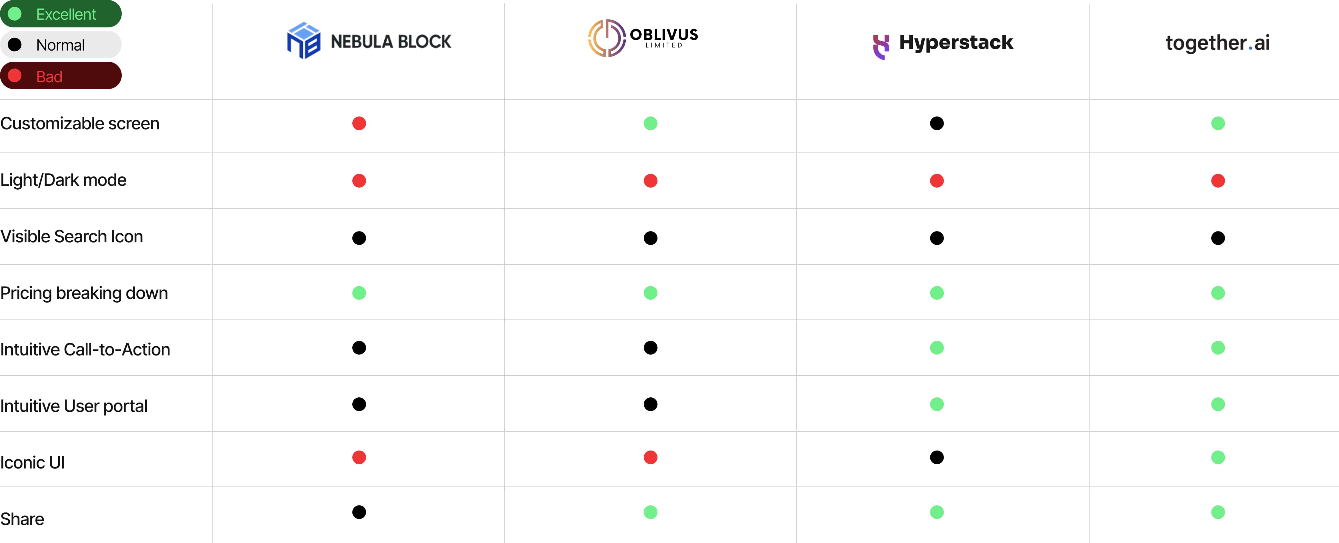
Before the design start, it’s necessary to study competitors website to get to know the industry standard. I need to develop a new looking to adapt the AI&futurist design trend by looking at competitor’s website.
A great product isn’t just about aesthetics—it must also be easy to use. Learning from competitors provides valuable insights, allowing Nebula to avoid common pitfalls and surpass industry standards. Clean and simple design remains the most popular choice in today's market. Exceptional products are crafted with a deep understanding of user psychology, utilizing design elements such as color, typography, and layout to create a truly user-friendly experience. This approach enhances user retention and strengthens market competitiveness.
Understanding the user's pain points is crucial before starting the design process. I have conducted extensive market research, and here are my findings:
Non-technical users find steps like AI model selection, data configuration, and API integration too complex.
Users struggle to evaluate the actual costs of AI cloud computing, especially with on-demand billing models that may incur unexpected fees.
Low bandwidth or network interruptions can cause unstable service performance.
Concerns about compliance with data encryption and privacy regulations (e.g., GDPR, CCPA).
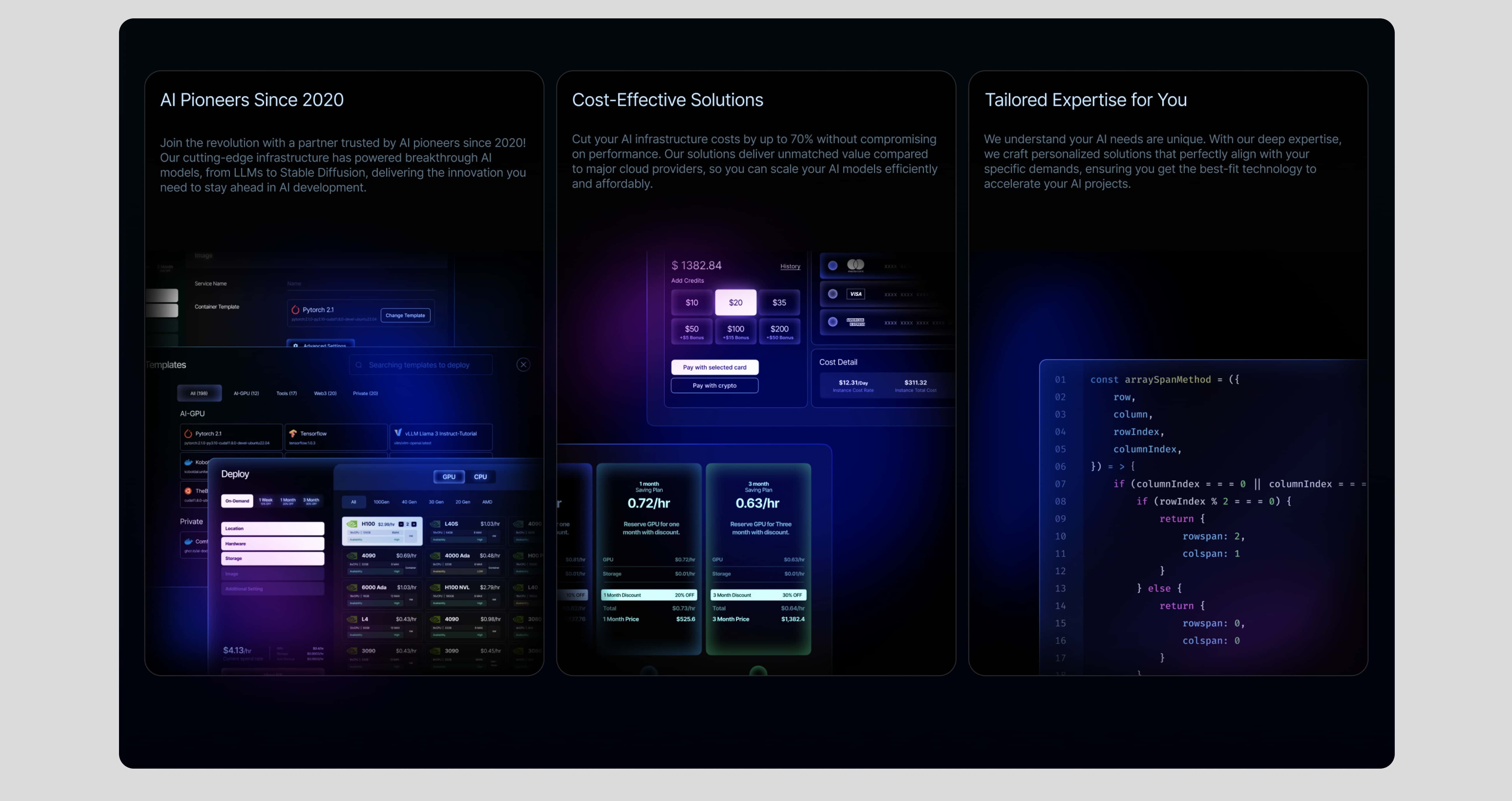
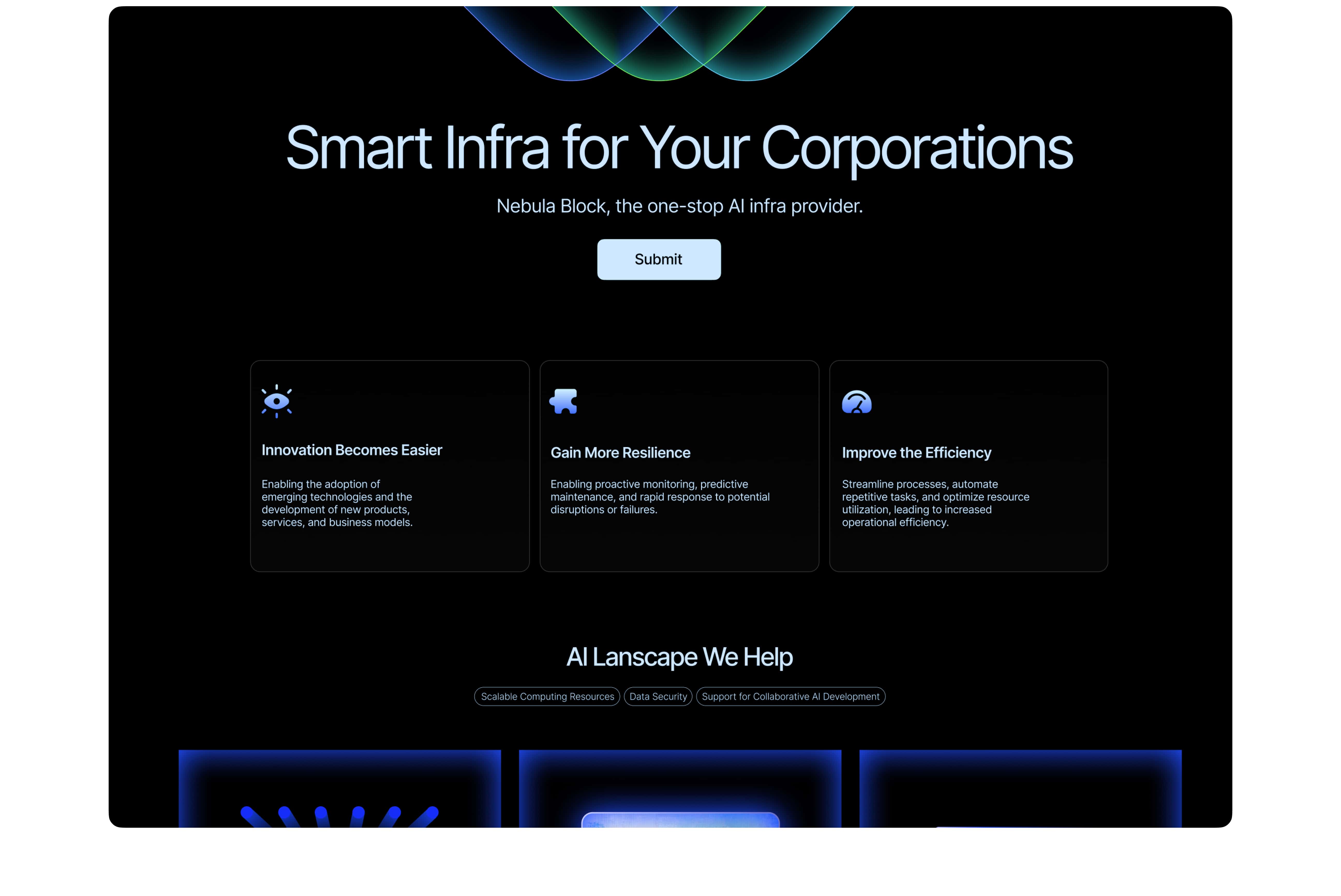
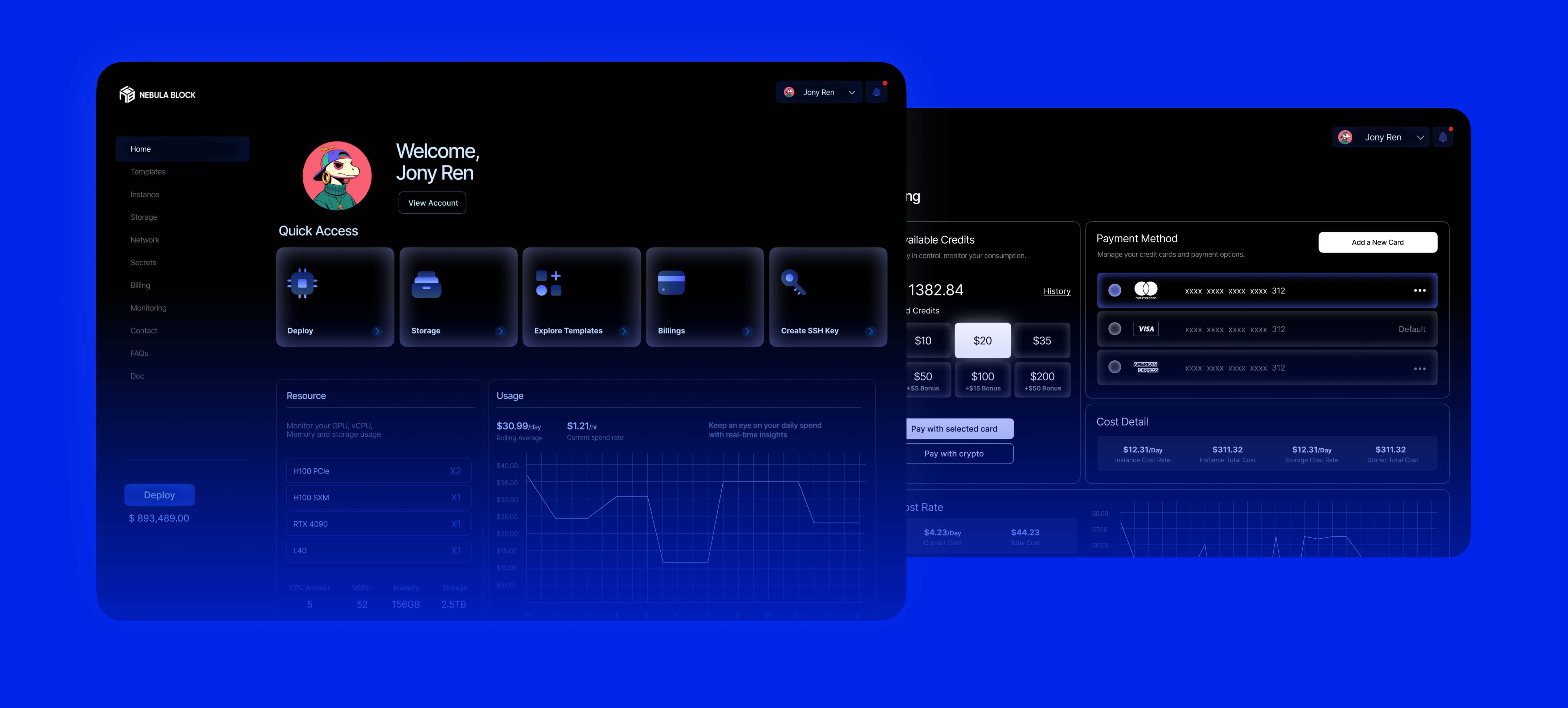
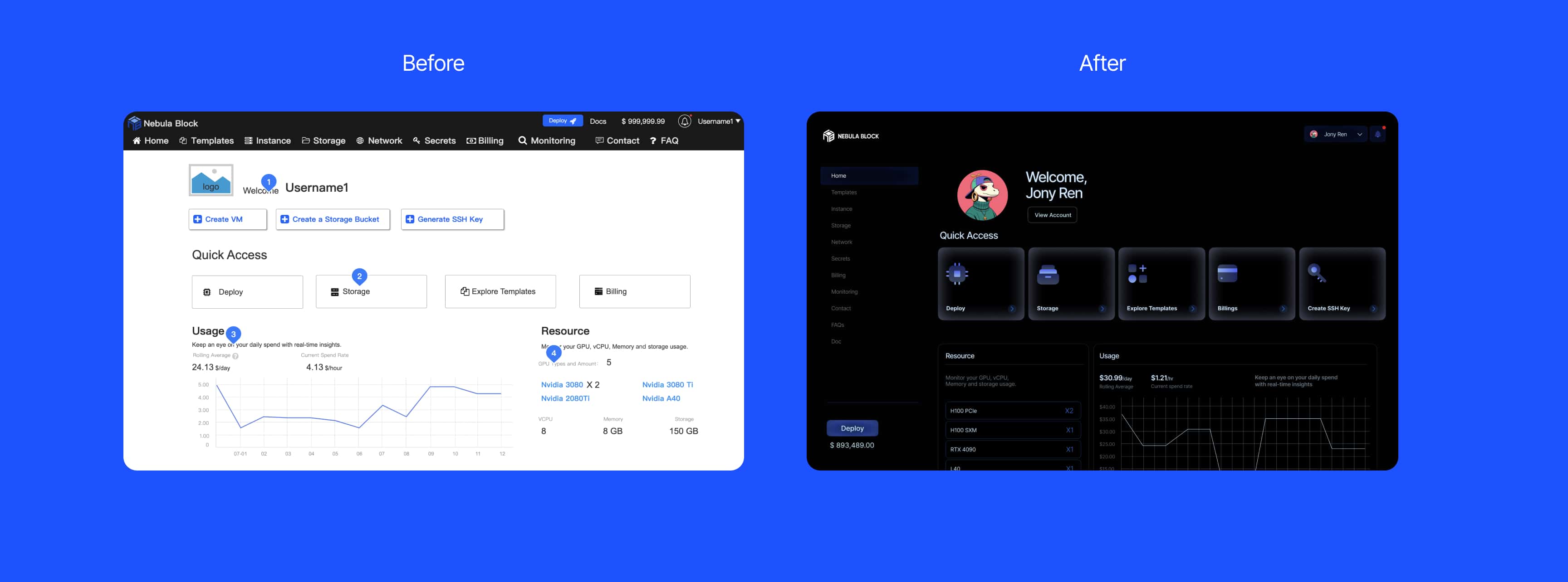
Rethinking the design will make Nebula more professional and trustworthy. My solution is to design a user-friendly portal. I’ve moved the top navigation to the side, changing the list orientation from horizontal to vertical. The active page is highlighted, while other items are greyed out, helping users easily identify their current location. The primary Call-to-Action button is positioned beneath the navigation, ensuring users can DEPLOY from any page, with the account balance always visible. The redesigned Home Page allows users to access the information they need faster than ever. Iconic and simple iconography enables users to quickly find the functions they require, while glowing buttons draw attention and psychologically increase users’ desire to click. This redesign prioritizes usability and intuitive interaction, enhancing the overall experience.
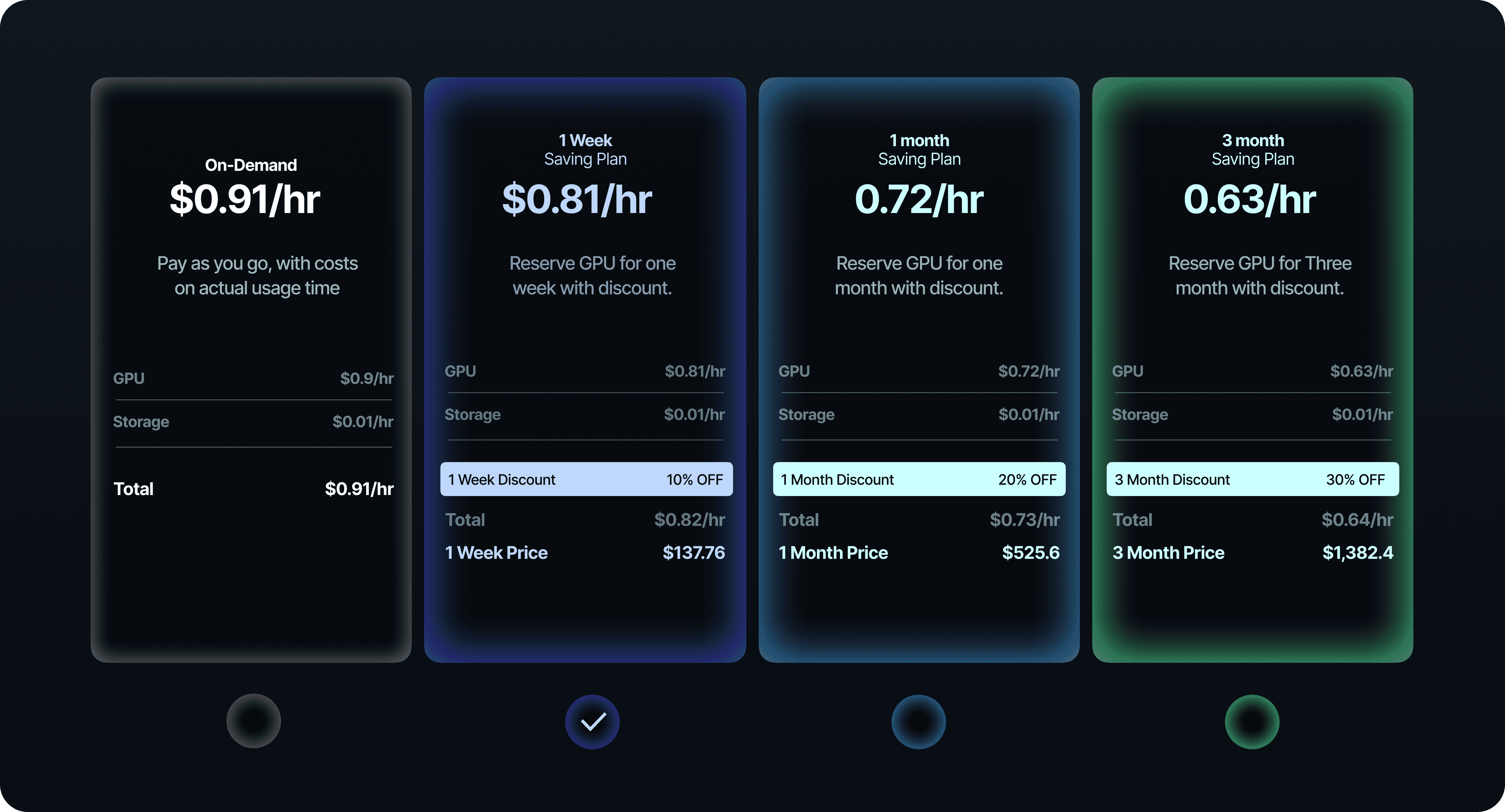
A transparent pricing structure helps users break down costs and compare prices after applying the long-term savings plan discount. By emphasizing the hourly rate, it encourages users to subscribe to the long-term savings plan.
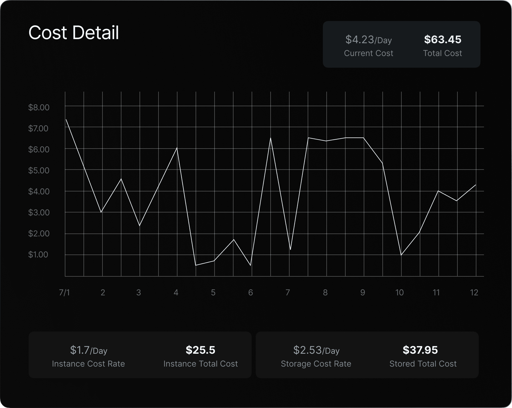
With real-time cost tracking, users no longer need to struggle to evaluate the actual cost.
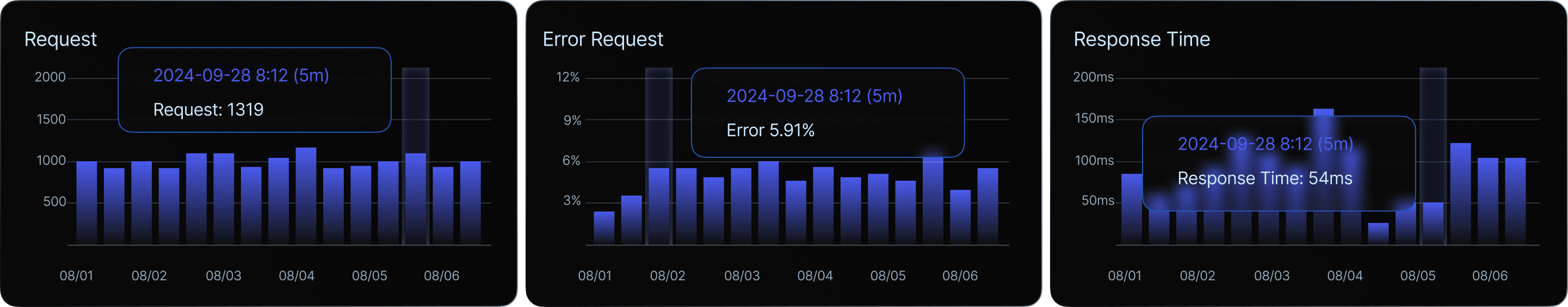
Monitoring computation speeds and real-time responsiveness provides an accurate reflection of the service's performance.
Nebula makes computing resources accessible to all, with a focus on small and medium-sized enterprises. Leveraging exclusive technology, Nebula enables remote linkage of server resources worldwide, optimizing data transmission efficiency. Intuitive web pages and a user-friendly portal empower users to easily manage computing resources. A clean and simple UI reduces the learning curve, enhancing user retention and overall product adoption.
To define which brand tone fits Nebula best, we need to start from its market position. Nebula is an innovative AI cloud infrastructure. This led to a series of questions: What does an AI product look like? What can Nebula do to stand out? What are the barriers in existing designs? I’ve looked into some success stories, such as OpenAI, Apple Intelligence, and Meta AI. I also researched companies running AI cloud services, such as Together.ai, Hyperstack, and Oblivus. From this analysis, I defined the brand tone that fits Nebula best.
Icons

The strategic use of internal glowing effects throughout the rebranding process effectively conveys a sense of mystery and futurism associated with AI. Dynamic animations enhance the brand’s sophistication and professionalism, creating a cohesive and memorable visual identity. This design approach is consistently applied across the brand, ensuring an unforgettable impression at every touchpoint.
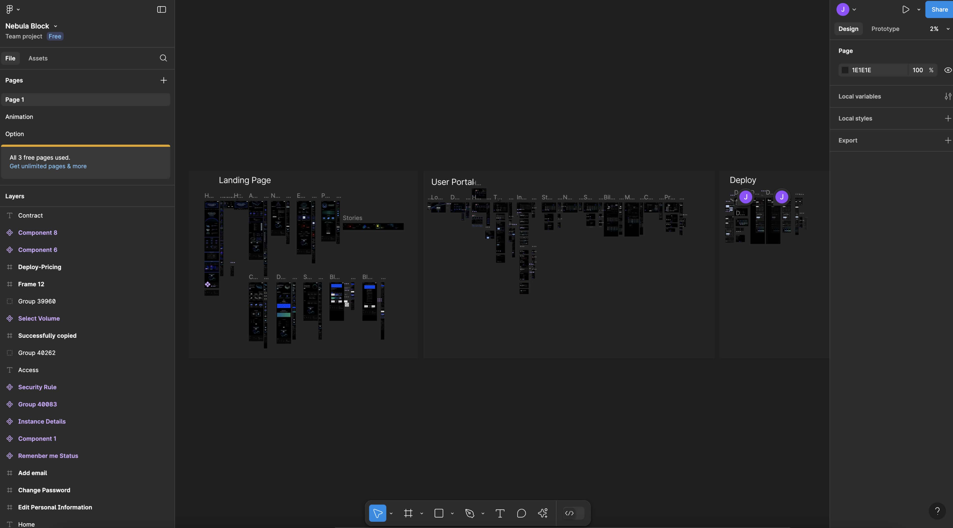
After defining the brand tone, I started to design the prototype. I began crafting from mid-fidelity wireframes to high-fidelity wireframes to visualize my thought.
A transparent pricing structure helps users break down costs and compare prices after applying the long-term savings plan discount. By emphasizing the hourly rate, it encourages users to subscribe to the long-term savings plan.
The dashboard is a critical page for users to manage their rental status. Its design has a significant impact on user retention, making it essential to ensure that it is highly intuitive and easy to use.
After completing the final prototype, the entire team convened to review it thoroughly to ensure no components were overlooked. My role was to refine the final design and ensure a seamless, user-friendly experience for the end users.
There are some of the highlights: